Most Important Keys for your Website Redesign

The web changes. It changes rapidly. It changes continually. This means your website must change.
What worked in web design 3-4 years ago can be outdated and lead to poor performance today.
As we all know, smartphones have increased nearly 100 fold from three years ago and so businesses now need to take into consideration the mobile and tablet experiences of visitors to their site. But it’s not only the growth of mobile phone use, there are multiple factors at play. Because of this, businesses and organizations are seeing the need to make significant changes to their websites to stay competitive.
Likely your business now has, or will soon have, your website redesign near the top of your priority list. It’s your online home base and first point of contact.
With web visitors doing nearly 67% of their research online BEFORE contacting a company, you need to ensure your website is delivering a good pitch!
One of the most important first impression points of your site is the “usability” for the visitor. If they can navigate easily and find things quickly, they’ll be gone in 6 seconds or less!
As you prepare for that website makeover, here are important keys for your website redesign.
Website Redesign Keys:
“Above the Fold”
It’s a web term and it means the immediately visible area in your browser when a user views a web page. Anything in the viewing area is “above the fold” and anything that a user must scroll down to see is “below the fold.”
It’s critical in any web redesign to keep your most important items of information “above the fold” so viewers have the best opportunity to see it. Great things buried at the bottom of a long web page are ultimately missed by the masses.
Remember, the main goal of your home page is to get them to a next page on your website! You want them to remain and to go deeper, so how can you up front show value and invite the visitor to go deeper? Use copy that is crisp and concise leading clearly to the important next actions you wish the user to take.
 What Problems do you Solve?
People use the Internet primarily for two key reasons, either to (1) be entertained (think social media), or (2) to solve a problem. This second reason is critical for your website redesign. A visitor cares more about solving their problem than what your mission and latest highlights were! Think through the eyes of your ideal customer. What problem do they have that they are looking to solve? Address that clearly and simply up front! “We help businesses like yours …..” Fill it in with your solution to their problem!
Remember, it’s not really about you, it’s about them. The more you can meet them at their point of need, the more success you can ultimately have.
A Mobile Responsive Website
I’ve already told you this is important and I’ll say it again…This is of CRITICAL importance!
If 30-50% of visitors to your site are going to use their smartphone, are you wanting to risk that high of a percentage not having a simple and quality experience on your site?
You’ve got a maximum of 6 seconds for your first impression.
If it’s not good, visitors will click away. They are making split-second decisions and it’s not largely based on quality of content, but on ease of use!
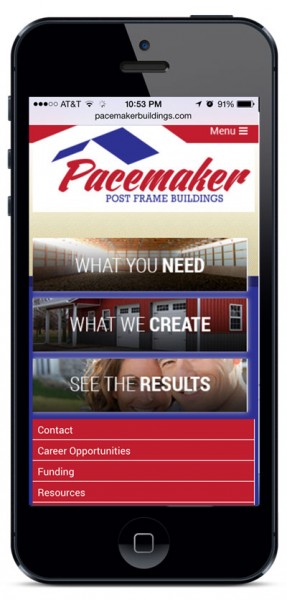
A mobile, responsive website is a website design that “responds” to the device being used to view the website. If on a mobile, it shows a mobile view, for tablets the tablet view, and for desktop and laptop users the full version. It’s a type of web design that aims to provide the best experience to all visitors. See one business example here: http://www.pacemakerbuildings.com.
How will you Capture Leads?
The good old “Contact Us” page remains as a standard page on nearly all websites but it’s not a game-changer or a strategic marketing tool to help you grow more leads online! You’re business needs a lead capture strategy.
It’s critical to move users from unknown fan to a known lead that you can nurture. The way to do this is with strategic lead capture that offers something of value in exchange for their email form sign-up (name and email address.) Just those two simple fields can be golden for your organization!
Visuals Convey More, Better, and Faster
Do not make the mistake of thinking you need to cram every piece of information in on the home page because it’s all so important! In fact, too much text can have the opposite effect and turn visitors away. Viewers on the web are “skimmers,” meaning they are skimming through information and, where too much text causes the gloss over effect, large, dynamic visuals can tell an incredible story in a few seconds!
It’s a fact that our brains process images 60,000x faster than text, so by adding powerful visuals and limiting text to concise, easily readable snippets you can communicate so much more, better, and faster than with three solid paragraphs of text!
So consider your images carefully!
Together these keys get you started well in having a new website that is designed for tomorrow’s web users and which helps your business stand above the crowd and move visitors to leads on the site.
Let me know if you want to talk further about these ideas as your business thinks of your next website!
