Responsive Website Design: Size Does Matter!
Pinching out to zoom, then sliding to find and read the area you want to see on a mobile or tablet size screen can be frustrating for the viewer.
Responsive design is the answer.
If you are not familiar with the term, responsive design is simply a website that responds or adjusts to the size of screen that you are viewing on. For example, a website should be easily viewable on a desktop computer, tablet device, or mobile smartphone.
Why responsive design is important:
- Mobile users will surpass desktop users by the end of 2014 for the first time ever.
- The biggest complaint for those viewing websites on mobile devices is that navigating the site is too difficult.
- 67% of users are more likely to make a purchase on a smartphone with a mobile friendly site than a non-mobile friendly site.
- 69% of tablet users have shopped via their tablet device in the past 30 days.
Your website visitors are already viewing your site on mobile devices, and that audience is simply increasing all the time. Make sure, then, that your website is ready to respond. Contact your web developer to see what it will take to make your website responsive. It simply makes sense to have a website that can be viewed by whatever device a user wants to see your site on!
People are busy, make it easy for them! If you don’t, they simply click and go somewhere else.
How to find out if your viewers are using mobile devices:
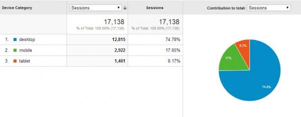
You can view the percentage of mobile and tablet users on your website in Google Analytics.
Once in Analytics, select a date range (we recommend the past 6-12 months), and then on the left navigate to Audience > Mobile > Overview.
On the lower right you’ll see a small pie chart button. Push that, and you’ll see a pie chart that will break down your percentages for mobile, tablet, & desktop visits to your website in the date range you selected.
Sources:
http://visual.ly/why-responsive-design-important-10-key-statistics


