Mobile and Tablet Internet Growth: Responsive Website Solutions

Screens are getting smaller….and bigger…and we simply have more of them!
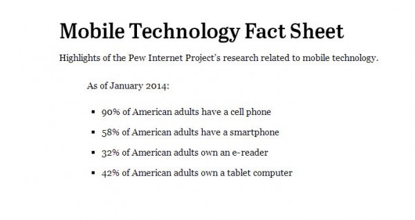
The use of the Internet has evolved quickly in the past few years! Gone are the days of only large desktop computers as primary methods to use the Internet. PewResearch outlined 2014 stats on the use of mobile devices and tablets, and the data was amazing!
Mobile Stats: As of January 2014
- 90% of American adults have a cell phone
- 58% of American adults have a smartphone
- 42% of American adults own a tablet computer
- 32% of American adults own an e-reader
It’s no wonder then that one of the fastest growing areas of web development is mobile and tablet friendly websites. These websites are called “Responsive sites” because they “respond” to the device size of the web visitor, giving them a great experience for their device. This means no more squinting to view details on a site for a mobile user, and a great view on tablets such as the iPad or Android tablets. (Side note: Looking for a great deal on a tablet? Check out WiredShopper.com.)
Solving a Problem: Growing Mobile Traffic
The Fan Varsity Sports Network (TheFanVSN.com) is a South Bend regional area organization that came to Digital Hill seeking a solution. They needed a website that would be easily accessible by users who were going to be largely split in mobile, tablet, and computer use.
Each of their ideal audiences needed to be able to have a great experience on their site as the foundation is providing relevant, localized sports information based on high schools in the great South Bend and Elkhart regions. A site that worked well for mobile, tablet, and desktop users was going to be essential for their future.
A responsive website was clearly the way to go!
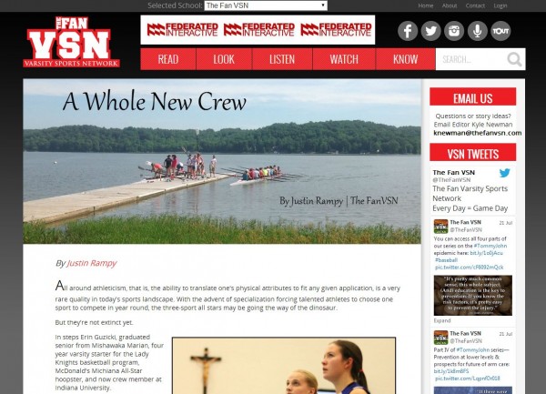
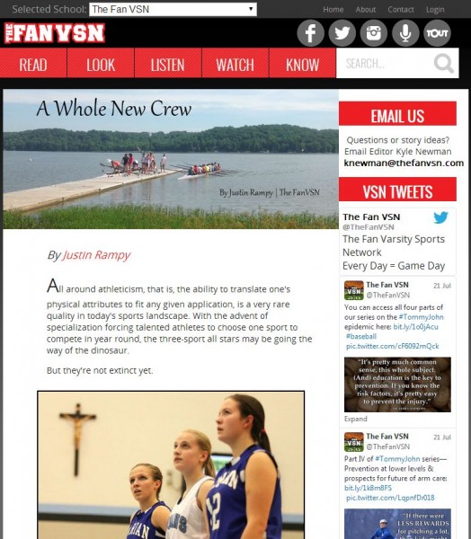
Digital Hill developed a site that worked seamlessly for each device type. Here are screenshots of each view:
Computer View of TheFanVSN.com:

Tablet Web View
The Fan Mobile:
The Fan VSN has a robust manager area enabling the web team to easily add new articles and feature key news on the home page. The site also allows visitors to create accounts and select their favorite sports teams to narrow down information to what is most important to them.
Social media integrations such as recent Tweets enables The Fan to showcase where else visitors can connect with them and the incorporation of multimedia audio and video items make the site a powerhouse of information in any medium.
With nearly 50% of mobile users saying they sleep with their mobile device next to them so they don’t miss information, having a responsive site with power to add content in multiple media formats that displays well and is customized to each visitor is huge!
So what do you think of this responsive website? Let us know below!


