Niche Educational Provider Website

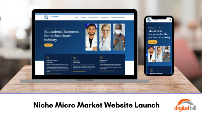
Having a website is crucial for all organizations in the modern world. However, a website also needs to be accessible and easy to navigate. Dane Garvin Ltd provides educational resources for the healthcare industry worldwide. To make accessing the important information they provide easier for students, clients, and medical offices, Digital Hill refreshed and updated this educational provider website.
Navigation
Navigating the new Dane Garvin Ltd website is simple with a main header menu and a footer menu available on each page. The options in these menus cover every topic a visitor could need. Through using a simple, one-click menu option website visitors can quickly find what they need. This saves the website visitor time while providing the information they came for.
Mobile Friendly
With over 90% of internet users accessing the internet from their mobile devices, having a mobile-optimized website is crucial. The Digital Hill team utilizes WordPress CMS to ensure that the new Dane Garvin Ltd website adapts its size and layout to match the visitor’s device. This ensures that the functionality of the website is the same, no matter what device is being used to access it. As an educational resource provider, this is an essential detail that helps them to stand out and continue to provide the service clients expect. Furthermore, Google pushes Dane Garvin Ltd higher in search engine rankings due to its accessibility on all devices. This means more potential clients can find the website.
Search Engine Optimization
Each webpage on the Dane Garvin Ltd website includes carefully curated copy to optimize its ranking on search engines. In addition to the curated copywriting, the Digital Hill team uses industry keywords in the meta descriptions and tags. Finally, each image features an alt description to increase search engine optimization and to improve accessibility.
Smart CTAs
On the homepage, there are three key call-to-action (CTA) buttons. These highlight the key offerings from Dane Garvin Ltd, including accreditation, turnkey solutions, and more about the organization. Additionally, there are three secondary CTA features. These include medical education opportunities, the technology they use, and how relationships and partnerships ensure success. The key CTAs use a yellow button alongside a large image to draw attention to the offering. The secondary CTAs use small yellow icons and yellow text links to draw attention to them. The yellow stands out against the blue background and classic white text, drawing the visitor’s attention to click through. By differentiating between these key links, website visitors can easily see all information snapshots without being overwhelmed and getting confused.
Any organization must have a simple, effective, and optimized website in 2024 and beyond. After all, most people now turn to the internet when researching, learning, or purchasing. Take your organization and website to the next level by contacting Digital Hill for a quote.
