5 Things Your Company Logo Needs

A logo is a fundamental requirement for any business. An effective company logo doesn’t just set you apart, it also gives your business identity.
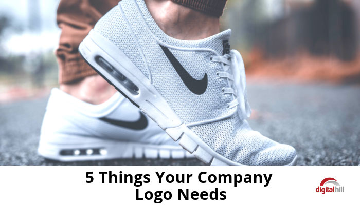
Consider global enterprises such as MacDonald’s and Nike. These brands have logos that instantly separate them from the rest. You don’t need to see the word “Nike” on merchandise to know that you’re buying a Nike item. As long as the famous check mark is present, you know that you’ve got the right product.
This is the kind of differentiation every SMB should aim for. You want to build a logo so dominant it effortlessly wins you leads and customers and even helps you convert sales. Such logos have five things in common.
5 things your company logo needs
1. A powerful message
A good company logo first and foremost conveys a strong message. The check mark in Nike, for instance, indicates movement and speed while the “b” enclosed in a white circle in Beats by Dre indicates headphones on the ear. If you want your logo to stand the test of time, you too should begin by finding a message for it. For instance, if you want to communicate a message of speed, incorporate symbols of speed. If the big message is environmental friendliness, utilize elements that communicate environmental friendliness.
2. A visual focus
What do you want people to see when they look at your logo? You have five options to pick from; a word mark, letter form, emblem, pictorial mark, or abstract/symbolic mark. Word marks are essentially freestanding acronyms such as IKEA and eBay. Letter forms, such as HP and Unilever, are typographic and use the company’s initials. Emblems, such as the LEED logo, are a fusion of type and graphics. Pictorial marks, such as the Twitter logo, are visual representations. And, abstract/symbolic marks, such as the Chase and Sprint logos, are symbols that convey a big idea. Which mark best suits your brand?
3. A target audience
Only focus on making your target audience fall in love with your creation. For instance, if you’re a women’s clothing retailer, dwell on impressing the women who’ll be buying from you. If other demographics don’t like the logo, no problem; in any case, you can’t impress everyone. Designing for an audience should be easy if you already have a buyer persona that you use for marketing. If you don’t, conduct research on your audience, find out what they’re like, and use the information to build the perfect logo.
4. A clear point of difference
Common challenge businesses face today is differentiation. However much you try to set yourself apart, you’ll always find a handful of businesses offering exactly the same products and services, and perhaps even using the same colors as you. A business logo gives you another opportunity to further differentiate yourself from the competition. Make yourself unique by appealing to new consumer segments, exploring types of brand imagery not being used by your competition, and letting your values and beliefs shine through.
5. Strategic placement
Finally, it’s also important to think about where the logo goes after it’s been designed. Most digital businesses will have it on their website. But, that shouldn’t be the only place to place your logo. Business cards (both hard and soft copy), emails, and your promotional materials should all carry the logo as well. Just remember that the logo might have to be resized to fit some of these materials. This makes logo size, resolution, and scalability important design factors.
If you can keep all the above considerations in mind, you’re on your way to creating a timeless logo that will serve you for many years. Need help with a new or modified logo? Our Creative Director is ready to help you with your branding needs. Contact us today!
