5 Tips for your Website Home Page

What makes a great website home page? Sometimes the best way to outline what you SHOULD do is to outline the key things you SHOULD NOT do.
Is your website home page really working for you? What’s the aim you have for it to accomplish? The answer to that is really quite simple….
The goal of the home page is to get them to the next page in your website!

If someone comes to your home page and leaves, you’ve failed.
Getting them to a second page means you’ve gotten them interested and they are ready to dig in further. Without this, it means they’ve glanced and moved on, and it’s much harder to get them to come back a second time!
The web is cluttered with information and people are busy. Therefore you have little time and you need to make the most of it.
You have one chance to make a great first impression!
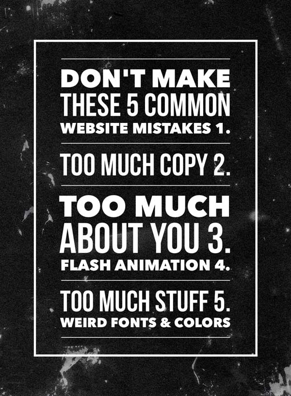
The issue is that far to many website home pages are failing and here are the five most common mistakes businesses make with details below the infographic.


Mistake Number One:
Too much copy.
Words, words, and more words cause home pages to fail.
As I noted, people are busy and they are skimming. Lines of text that you think are glamorous and explain all that you do simply blur together into a mass of letters to the skimming eye! Businesses must really boil it down on the home page and keep it simple.
Mistake Number Two:
Headlines and copy about your stuff.
Jay Baer, a noted author and digital media consultant outlines in his book, Youtility, that people are on the web for generally only two reasons. Either to solve a problem or to be entertained. They use social media for entertainment so they are coming to your website to see if you can solve their problem.
The solution, therefore, is to answer how you solve the problem they have. It’s not about you, your products or services, but about them. A great home page outlines the problems your company solves.
Mistake Number Three:
Flash animation.
Animation that requires the browser to have and use a flash player to perform groovy animation and a sequential series of images fading in and out is not helpful. Why? Many devices like Apple products including iPhones and iPads do not support flash and therefore visitors on those devices typically get a blank screen or blank area, or worse yet a big red “x”.
Again, too much animation is too many moving parts. Keep it simple.
You’ve got about 3-4 seconds to capture the attention of the visitor and communicate to them that you can help them with what they need.
Mistake Number Four:
Too many points of interest.
Loads of navigation buttons, competing images, and paragraphs of text all serve to cause viewers to see a dense forest and miss the individual trees! Again, people are moving fast on the web and you have precious seconds to capture their attention and communicate to them.
Give them your one best thing, not the top eight categories and also the five sub-categories you offer because they’ll see only one or maybe two of those items before they move on!
Mistake Number Five:
Bad colors and weird fonts.
Have you noticed a theme? Less is more.
They have a problem, you need to share how you solve it.
Fancy fonts can be hard to decipher and even worse to discern on mobile devices. As well, dark backgrounds with lots of small white text are great if you are in a dark room and have a magnifying glass but that’s not your everyday web visitor! What’s the default background in Microsoft Word? White, with a simple font. That’s done for a reason.
I could go on with a few more points but I’ll bring it to a close to allow you to reflect on your site in relation to these key points.
Take a fresh look at your company and competitor websites soon and see how things rate.
What’s your next doable action step you should take? Got questions? Let our web consultants help you!
