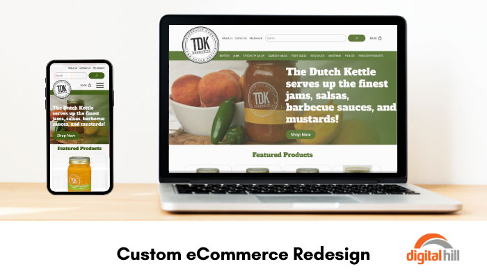
Custom eCommerce Redesign

Natural local ingredients, homestyle recipes, and love make The Dutch Kettle products loved by many. However, operating in the digital realm requires a memorable and effective website that represents your brand. The Dutch Kettle needed a refresh of their online marketplace where they sell their homestyle jams, salsas, and condiments worldwide. Below are the key features of the custom eCommerce redesign for The Dutch Kettle.
Featured Products
When visitors land on the newly redesigned website for The Dutch Kettle, the first thing they see are the seasonal featured products. These high-quality images of the products draw the visitors’ eye, and the ‘Add to Cart’ button makes shopping a breeze. The price is also clearly listed right under the image. If website visitors need more information about the product they can simply click on the image or name.
Recognizable Branding
The redesign of The Dutch Kettle website focuses heavily on the new logo and color scheme. The modern refresh and new round logo stand out against the traditional green from the old website. This ensures old customers still recognize the brand as they get used to new packaging. The theme of the website is natural and embraces warm greens and white alongside clear images showcasing ingredients and the products in use.
Simple Menu
Just like their delicious products, navigation on The Dutch Kettle website is simple in the best way. At the top of the page, visitors can see all the different categories of products available, from jams and sauces to salsas and pickles. While visitors are viewing the category of their choice, they can then shop for other categories from the left-hand side or from the main menu. The flat-rate shipping prices are also clearly listed alongside the products, making budgeting easy.
Robust eCommerce System
The Dutch Kettle redesign is supported by a robust eCommerce system. This makes it easy for the team to add products, manage inventory, and update product descriptions. The backend is intuitive which is crucial, especially as new seasonal products need to be added and removed. Setting the top four featured products for the homepage also just requires a click of a button.
Easy Checkout Process
Once visitors add products to their cart, they simply click the bag icon in the top corner to review their order. If visitors need to change the quantity or remove an item, they can do so with a single click. Products in the cart show the price, size, and product name. Once the visitor is happy with their cart, they simply click ‘Checkout’, which takes them to the contact and shipping address form. Visitors fill out their information, enter the payment details, and click ‘Place Order’ to complete their purchase. For returning customers, there is a login option that auto-fills in their address details.
The redesign of The Dutch Kettle website brings their new modern packaging and logo to their online customers. This modern refresh keeps the natural and authentic feel of the company and its products while offering a more pleasing shopping experience. Furthermore, the new website works smoothly and effectively on all devices, from computers to mobile phones, meaning customers can shop from anywhere at any time.
Want to offer your product to customers around the world? Contact Digital Hill for a free quote and get started on bringing your business to the digital realm.
