Event Registration Website for the RV Industry Power Breakfast

The RV Industry Power Breakfast is an annual event that brings together stakeholders in the Recreational Vehicle industry in the RV capital of the world, Elkhart County. The event provides an excellent platform for attendees to assess the past year while casting an eye into the future and how trends are shaping for the industry going forward.
With key guests like Governor Mike Pence and state and national representatives giving input, it’s a key gathering of the industry. Discussions focus on the progress made in the year while highlighting the challenges facing the industry. The RV Power Breakfast event is a major event for the Recreational Vehicle Industry and they need a slick website for registrations of the over 800+ attendees.
Digital Hill was contracted to supply their website which would market the event and allow attendees to register tables or as individuals for the event.
What did this RV industry website need?
Our main responsibility was to design an efficient registration website for the event that was mobile friendly. The site had to be appealing while remaining effective at its core function – allowing companies and people to register for the event. For the event registration website to work, these factors had to be considered.
Immediately grabs attention and registrations
When designing event registration websites, the main page should have a carefully-thought-out flow. 3 main areas of the main page which are critical to the design.
- The top right corner
- The area “above the fold” in the middle of the page
- The navigation bar
These are the areas that most web visitors usually look at when they first arrive on the site. Failure to use these 3 areas properly could lead to under-registration. That’s for desktop, then there are mobile considerations for loading speed, easy use on small screens and more. All of which we addressed.
Readable and understandable
A common problem with event websites is that the designers are tempted to add a lot of details. So, often, you’ll end up with pages full of text or banner ads. Having all this content on the same page could distract the visitor which could potentially impact registration.
Registration forms
The number of fields to be filled out should be as few as possible. Too many fields may cause confusion which will affect registration. Capturing the information entered into these fields should be easy. And once prospective attendees give their information, it should be kept safe and secure.
Digital Hill tackled each of these issues methodically.

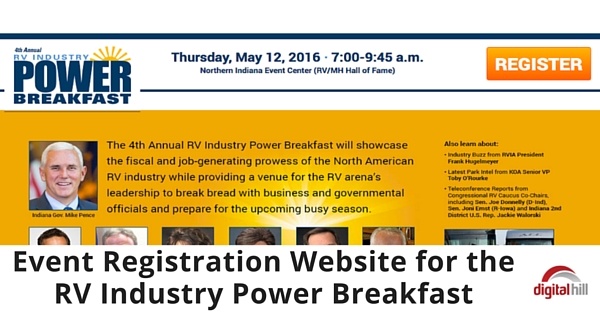
Digital Hill made sure the right-hand corner (the most viewed area of any website) contained a bold “Register” button. Written in capital letters, in a white font against an orange background, this call to action brilliantly grabbed a viewer’s attention. The “area above the fold” contained the name, date (and time), and venue of the event.
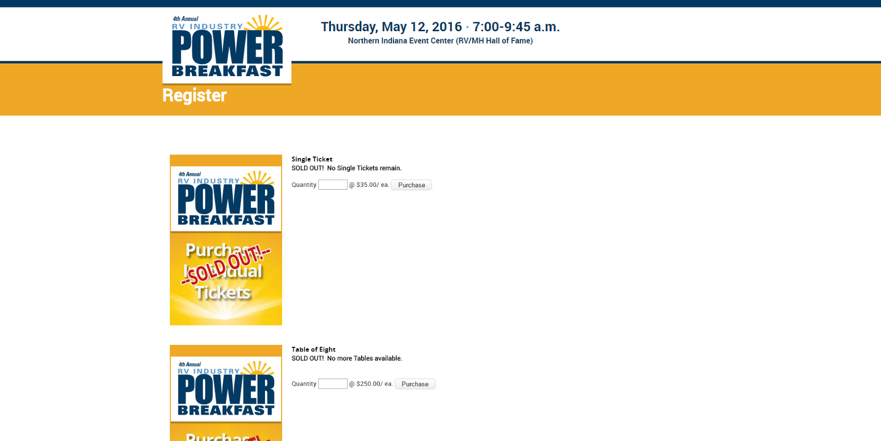
To address the need for “less” content, the text on the registration page is kept to a minimum. There’s a lot of white space and the only call to action on the page are 2 “register” buttons.
When you click the “Register” button, there is only one field to be filled depending on the type of tickets the visitors purchase. The rest of the registration page is primarily white space. This helps to concentrate the attention of the visitor on the registration process.
The site performed well on mobile, tablet, and desktop and helped contribute to a smooth checkout and ultimately a sellout of tickets for the event!
Why choose Digital Hill
Digital Hill is a Web Design and Marketing Company that helps organizations, both for-profit, and not-for-profit, get noticed on the web. But even more importantly, we help these organizations painlessly manage their websites with powerful web tools. Our simple CMS platform makes back-end activities, such as accepting payments and processing tickets quick and easy.
If you’re planning an event in the near future, contact us today and let’s help make it a success!
