How Typography Affects Readability and Why It’s Crucial for Effective Design
Many people consider typography to be just choosing the font, while it is a fundamental aspect of any design, as it directly influences the way people perceive your idea and work. No matter if it is a website, a poster, or any type of advertisement, you need to be extra careful when choosing the font and make sure it aligns with the message you want to send. This article will help you realize why typography affects readability and why it is extremely crucial for an effective design.
Why Is Typography Important?
Typography is crucial for the initial connection between your content and your readers. This is the first contact they have with your design. As we know how important the first impression generally is, you need to choose the font carefully. Well-chosen fonts can also enhance users’ experience and can make reading much easier and quicker. Remember that all the smallest details affect how clients see your content and how they perceive the message you want to convey. Make sure typography aligns with the point of your content and your overall design, so always try different fonts and styles and if possible, ask someone for advice on how they perceive the design.
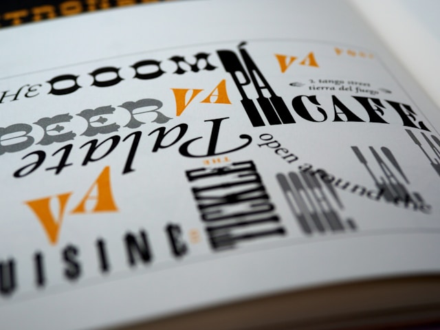
Font Choice
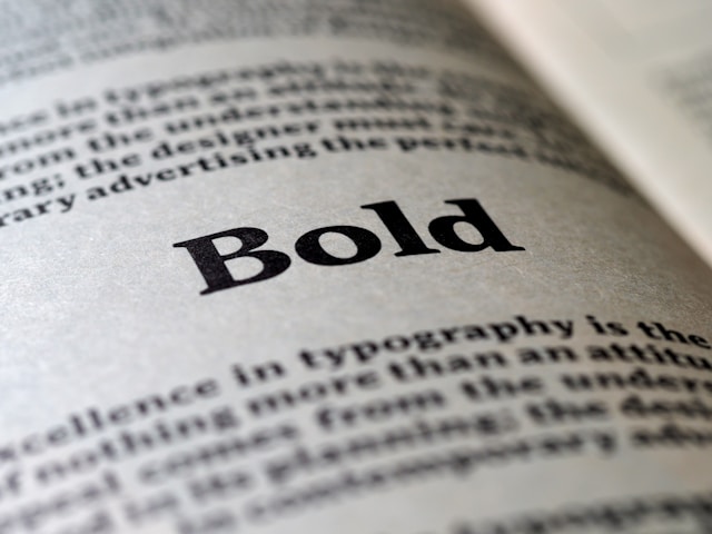
Now the real question is, how to choose the right font? This can be difficult, but it depends on the content you promote and the audience you want to reach. Different fonts convey different moods and contexts and you need to be careful. For example, serif fonts are often used for printed material as they are easy to read and are somewhat simple. Keep in mind that overly decorated fonts can be a great choice for logos or headings, but can be problematic for bigger texts and can be overwhelming for readers. Do not forget to adjust the font for different screens and devices because if you make a design on a computer, it might not be suitable for phone screens.
Shaping Brand Identity
Even though people do not think this is possible, typography plays a crucial role in determining your brand’s identity. You need to choose the font based on the type of your content and design. If you do not understand how to choose or come up with the perfect font, you should consider consulting a professional. For instance, font designers at blkbk.ink offer a wide range of options and you will, for sure, find something for your needs and preferences. It is important to determine whether you need a font for luxury and professional brands or something playful. Also, remember that your brand and design can become highly recognizable just because of a unique style and font, as is usually the case with big brands.
Text Alignment
Many people do not consider text alignment of great importance for the overall readability. For example, in printed documents, justified text is usually necessary, however, it can create uneven spacing between the words and can affect readers’ enjoyment, making it difficult to read. Centered text is perfect for titles or short quotes but can also be problematic for longer paragraphs. Create and compare different choices, and ask more people for their opinions on whether it is difficult to read and understand the design and its purpose.
Color Contrast
What many people do not understand is that typography is not only about fonts, spacing, or text alignment but also about how you combine the colors to achieve readability and the style you want. The contrast between the background and the text color should be high enough to ensure clarity and not to trouble anyone when trying to read the text. You can follow some contrast guidelines and make sure to combine the colors that provide readability and contribute to the overall look of the design. Find the perfect balance and ensure you follow it.
Other Key Factors in Typography
For better readability, there are some key factors you need to keep in mind. Besides the already mentioned font choice, which is one of the key factors that can affect the whole design, the second one is font size and you need to ensure to choose the perfect font size, not too big or too small. However, if you want to make sure your font improves readability, you should rather choose a bit bigger font, as this makes it easier for your users to read. Find ideal spacing, as this is one more detail that has a great impact on the overall experience because if the spacing is not proper, the text can feel cramped. On the other side, too much spacing can break the flow of the whole text and it can be more difficult to remain focused and understand the message the design wants to convey.
Impact on Emotions and Engagement
Even though it seems impossible, fonts can evoke certain emotions or they can be a great tool for emphasizing the emotions your content wants to evoke. Decorative fonts can evoke happiness and playfulness, while simple and modern ones signal modernity and seriousness. Readable, well-designed fonts can highly increase engagement and reduce bounce rates, especially on websites. Also, remember that the user experience depends highly on how you arrange the text and the whole design. Everyone knows that when something is too difficult to read, you are more likely to give up and avoid that type of content. Take some time, determine what type of message you want to send, and make a thoughtful decision.
Typography has crucial importance in any type of design, and you need to pick the font and adjust it carefully so that you know your visitors won’t have any problems reading and interacting with the content you promote. Based on the audience you want to reach, their preferences, and the type of your content, you choose the font and evoke the emotions you were planning to. With the help of this article, you now understand how important typography actually is and why you should take some time before making the final decision as one small mistake can ensure your design is perceived in the wrong way or attracts the wrong audience.