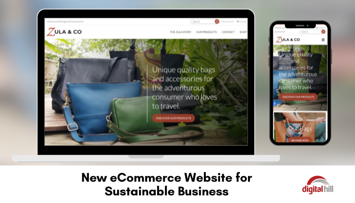
New eCommerce Website for Sustainable Business

In the current climate, consumers care about how companies source and create their products. Zula & Co is a unique company, offering bags that are sustainably made and paying employees a fair wage. To sell their products, Christine wanted a website that accurately reflected their principles and product quality. Below are some of the key details of the new Zula & Co eCommerce website for this sustainable business.
About Us Section
As a small business, explaining the inspiration and background of Zula & Co was very important. The ‘Zula Story’ section of the website goes into detail about this, while showcasing a video of a bag being made. The video shows the entire process from the pattern, to selecting the fabrics and even the hardware for the bag. Not only does this show website visitors that every product is handmade, but it also shows the care and dedication to quality.
The history of how Zula & Co came to be is interesting and easy to read by utilizing text blocks, short paragraphs, and color blocks.
Simple eCommerce Layout
Shopping on the Zula & Co website is simple, through the ‘Our Products’ tab. Here each type of bag is showcased with a short description and a CTA button. By setting up the eCommerce section of the website like this, it is much easier for website visitors to find what they want.
Instead of searching through all of the options, they simply select the style they like, and then click through to see the various finishing options in each style. Once the visitor selects a section to browse, they can also quickly view other sections using the sidebar on the right-hand side. If visitors would like to view all the products at once, they simply select the ‘Shop’ tab.
Contact Options
All good businesses have a clear and simple way for customers to contact them, and Zula & Co is no different. Website visitors can easily contact the Zula & Co team by filling out the contact form. Each section is clearly labeled with whether or not it is necessary, and users can type their questions, concerns, or feedback in the large message box.
Once visitors submit a form, Zula & Co receive an email notifying them, with a copy of the details. This allows quick response times and simplifies customer service, as all the necessary details are in the email.
Mobile Responsive
Around 50% of website visitors are using their mobile devices, and around 56% of sales are from mobile users. This is why it is so important to have a website that works well and looks good on any device.
By using WordPress as the content management system, the Digital Hill team created a fast, effective, and useable website for any device. The website loads rapidly and resizes to fit any screen. This means users do not need to scroll side to side to access information.
The new Zula & Co website is customized to their needs while keeping user experience and branding in mind. The simple, yet dynamic website showcases the sustainable practices of their production. Furthermore, it shows visitors exactly what they are getting when making a purchase.
Is your website in need of a facelift? Contact Digital Hill today to discuss your website needs and get a free quote.
