New Responsive Church WordPress Website

In the current world, it has become even more important for churches to have a space in the digital world. For instance, you can now operate an online ministry, share messages live, or share video recorded sermons with the community digitally, as well as communicate the latest events to inform and update your community. This allows your church to stay connected, no matter the circumstances.
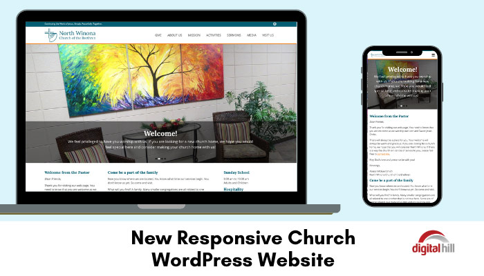
An interactive church website also increases engagement with the community and helps keep the congregation active and engaged. With WordPress being an excellent website builder, you should consider using the platform to have a website built as we did for the North Winona Church of the Brethren. That said, below are crucial details that we included in their new, responsive church website.
1. Branding and Media
Unlike other websites, church-related themes and media are a crucial feature. As you select a website builder to use, make sure that the tool has customizable areas that can be laid out in a visually appealing way. For this, find a builder with flexible features, which can bring forth the Sunday morning look and feel digitally. Similarly, you should use complementing or the same graphics on the website bulletins, webpage backgrounds, and corresponding church events.
2. Prominent Church Logo
A study conducted by Missouri, which monitored eye movements of website visitors as they scanned a webpage, showed that new visitors spend approximately 2.6 seconds scanning through a website before focusing on a specific section. However, following the general scan, the website’s section that received the most attention from the participants was the logo. Website visitors spent approximately 6 seconds, focusing on the logo before moving on to other areas. That said, you should ensure that the church logo stands out prominently on the website as this is a key identifying symbol of your church.
3. Navigation Menu
The navigation menu is another section of the website that commands significant attention. Surprisingly, the navigation menu is often one of the trickiest parts for web developers to get right. However, the main goal of a navigation menu is to guide visitors to other key pages with ease. That said, a responsive church website should have minimal navigation items. If there are too many, people glaze over and simply leave.
Key navigation menu items to include are the mission, about section, activities, sermons, news, media, and contact page. If you have more items, take advantage of a sub-navigation menu to add more items. For example, the sermons menu tab includes the sub-categories; Latest Sermon, Live Streams & Sermons, Topics Going Forward, Giving, and a Worship area.
4. New Visitor Information
Another crucial element to include in a church website is new visitors’ information. Unfortunately, many church websites don’t have an easily accessible new visitors tab.
Without a doubt, attending a new and unfamiliar church can be uncomfortable. Therefore, to ease everything, dedicate a prominent portion of your website to acknowledge and welcome new members. The tab should guide new visitors on where they can register, quote inspirational and welcoming verses. Additionally, you should provide guiding resources to new members.
5. Social Links
Like any other website, the importance of social links cannot be ignored. The same study by Missouri uncovered that participants spent at least 5.95 seconds, focusing on social links. That aside, linking your church website to external websites is an excellent way to cross-promote. As such, include links to active social media platforms.
6. Mobile Friendly
With Google’s announcement that most recent Google searches originate from mobile devices, you should ensure that your church website is mobile-ready and responsive. To ensure mobile responsiveness, the website should adjust in size and structure to suit the dimensions of the device being used. Otherwise, you could be frustrating most people who prefer visiting your website through smartphones.
Bottom Line
It takes a few seconds for a new visitor to make the first impression of your website. Since the first impression solely relies on the homepage, make sure that your church website meets the visitors’ expectations by including the above key features.
If your church is thinking about a new website, contact our team at Digital Hill to partner with us to bring your site needs to life for your church!
