New Website Design: My Crossroads Community Church
The Non-Profits Dream Website
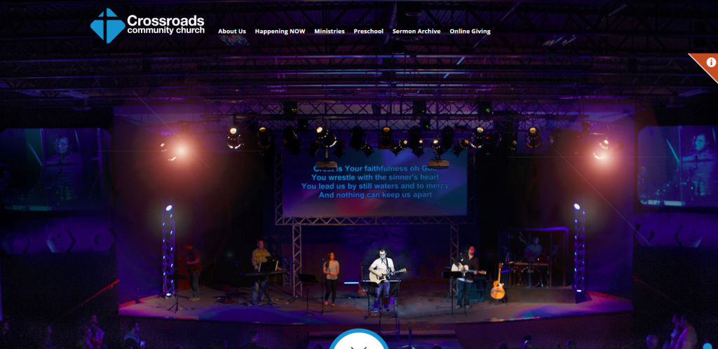
Crossroads Community Church wanted a new website, so they came to Digital Hill. They need to attract visitors and new members and access current membership info quickly. What did we do? We gave them the website of their dreams! Their new website achieves so many things many non-profit groups and churches want their online presence to do. Give Crossroads Community Church’s website a test drive and tell us what you think in the comment section below.
Why is this new website a Non-Profits dream? Here are the highlights of the key features.
- Unique sections of Ministry
- Easy to update and maintain
- Simple user navigation
- 100% Mobile Friendly (Responsive)
Unique sections of Ministry
When looking for information on a website sometimes all the page blur together and when you go to find a point of contact, companies sometimes only give you one phone number or give you one email address. Tell me if this situation sounds familiar? You go to Google search for a certain piece of information, which takes you to a website, you take a minute or two a digging for an answer and you have no luck finding it because one, the pages of the website are not easy to read and two, there is no contact info. Your last option is to give the company a call or shoot of an email to an info@ account in hopes of getting through to the right person.
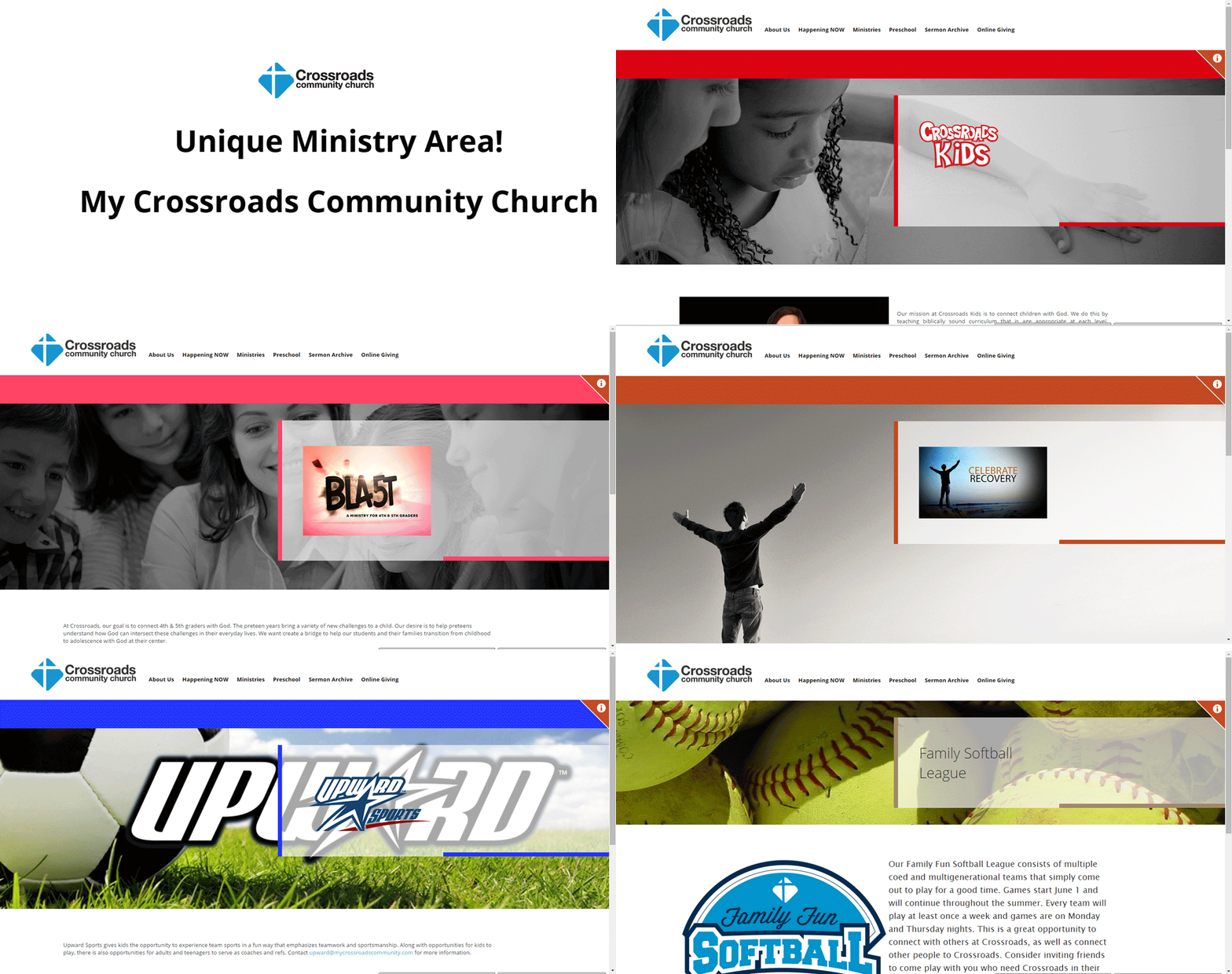
While that’s not the case with Crossroads Community Church, they took the mystery of knowing what page you are on and who to speak to right out of the equation in the example provided above. On the Ministries pages of the Crossroads website they provide a unique look to draw attention to the fact that you are on a different Ministry’s page. They also give the best person to contact for each ministry that way people with questions, who don’t find what they are looking for online can easily reach the correct person, with the click of a button. Check it out for yourself! If you think this is an awesome idea, give us a comment below.
Easy to update and maintain
A Content Management System (CMS) makes it easy to update a website. Search engines are looking for recent (up to date) and relevant information, and a CMS gives you control of your website’s content. The Crossroads Church website has Search Engine Optimization (SEO) features, which improves their website rank, so they’re found on Google or Bing. Their website has Digital Hill’s new custom backend CMS, which controls all content, including images, text, and adding and deleting pages. Crossroads Community Church doesn’t need to rely on a website developer to manage their updates. We make the web work for them and give them control!
Simple user navigation
Is your website easy to use and navigate? Can you find what you’re looking for in 3 or 4 clicks? If you can’t, it’s time to re-organize and update your website. Website re-development might be your best and most cost effective solution.
To get a better understanding of how your website is performing use Google Analytics. You’ll be able to track your visitors and their movements on your site. If you find that users are leaving the site quickly like Crossroads Community Church did, then it’s time to re-organize or re-develop your website.
A few signs of a website is hard to navigate and use could be:
- There is no website organization. Content is randomly placed and is hard for the user to find.
- The site could be out of date, meaning it hasn’t been updated in awhile. If a user has to call to get current information they’re probably frustrated.
- Make sure the navigation menu is relevant for what users are looking for. Meaning choose the best keywords that lead your visitor in the right direction.
100% Mobile Friendly (Responsive)
With the rise in mobile devices and Google & Bing changing their search algorithm to show favoritism to mobile friendly sites, it’s more important than ever to have a responsive website.
Check out these facts:
- At the end of 2014 mobile users surpassed desktop users for the first time ever.
- 85% of customers interact with your website before they ever contact you.
- The biggest complaint from mobile device users is that navigating the site is too difficult.
- 90% of U.S. adults have a cell phone (Pew Research 1/2014).
- As of September 2014, 72% of American mobile users have a smartphone (comScore Report).
- 67% of users are more likely to make a purchase on a smartphone with a mobile friendly site than a non-mobile friendly site (Pew Research 1/2014).
Crossroads Community Church knew they needed a 100% mobile friendly (responsive) website, which is exactly what we gave them!

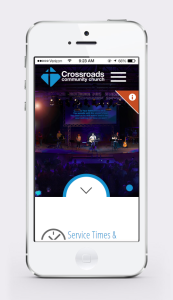
All of these features make this new website helpful to the targeted website user, and Crossroad Community Church because the information is well organized and very intuitive. It’s got a unique page structure, which makes finding and adding information very easy.
The custom CMS makes updates and maintenance so easy a 5-year-old could do it and of course it’s 100% mobile friendly (responsive), which makes both users and search engines happy. Making their website and content more “findable” in this crazy digital world!
If you need a high-end, professional, responsive website, please contact Digital Hill for a free quote! We make the web work for Goshen, South Bend, & Michiana and the world!
