Our Newest Website BalancedGrowth
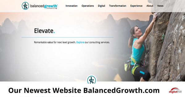
 Crisp, clean, and to-the-point, the website created for Chicago consulting firm Balanced Growth is succinct, professional and client-focused. Over the course of 5 decades, Balanced Growth’s mission has been to provide long-lasting value and innovative operations solutions to clients in the insurance, healthcare, nonprofit, financial, and associations sectors. Our newest website BalancedGrowth.com serves as an excellent introduction to the firm and its services.
Overall Design
The site’s design is based on simplicity, tight organization and a user-friendliness. This is especially evident on the homepage. Right below the header and navigation is a dynamic rotating gallery. Hence, the images and copy draw users to the business’s services page.
The site is sectioned into 4 distinct parts: footer, news, BG360, Transformation Method, and Consulting Services. Leading visitors to learn more about their services. These sections break up the page while presenting the firm’s most crucial services in a digestible format.
The predominate colors of this site are blue, black, white, and hints of orange. In essence, reflecting the site’s themes of intelligence, innovation, creativity, and professionalism. The color scheme is subdued, used conservatively and is never distracting. Blue and orange (a classic color combination) gently highlight standout text and ideas on pages.
Responsiveness
Mobile responsiveness is an important feature is today’s web. Balancedgrowth.com has a responsive design with an easy-to-follow flow when viewing on mobile.
Javascript and Jquery allow every main feature of the site to be flexible and responsive. This enables the content to be viewed and interacted with on multiple screen sizes. For example, the navigation bar. On the desktop, it stretches across the screen. On a mobile device, it is condensed into a more manageable drop-down menu on mobile.
This approach allows users on smartphones and tablets to have access to the same content as desktop users. Since much of the modern business world uses mobile, Balanced Growth Consulting will reach more potential customers with a responsive site design.
The Tools Behind the Website
The attractive user interface can keep visitors on a site. However, it’s the background website tools that attracts the site’s visitors and keep it running. On Digital Hill’s CMS interface, admins can edit and preview the site’s pages and their content.
Galleries
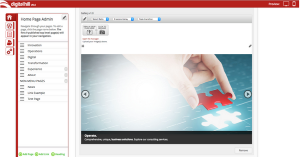
In the CMS, you can edit the image galleries on the site by:
- Adding or removing images
- Changing URLs the images link to
- Editing gallery transitions
Pages
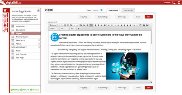
Updating or changing the content of a page, re-ordering pages or creating new pages is accomplished with a few clicks in the CMS.
SEO
SEO serves as the traffic driver on a website. With the CMS, you can add keywords to the page meta description as needed.
Does this sound like a website your business could use? Contact Digital Hill for more information.


