Private University WordPress Website: Radiological Technologies University VT

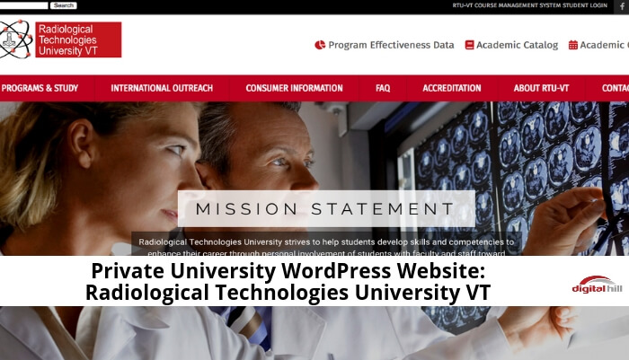
Radiological Technologies University (RTUVT) new website by Digital Hill was recently launched. See it here, rtuvt.edu. This new website is sleek, functional, and modern — an accurate reflection of what RTUVT is as an educational institution.
It also has the following features:
Mobile friendly
The website displays well on screens of mobile phones, even ones like iPhone 5s or SE. Whereas the desktop site has a horizontal orientation, the mobile site has a vertical one, making it easy to navigate. Especially on smartphones, as well as tablets and notebooks.
Visuals Enhance the Website
The content is a balanced mix of textual and visual. It’s all presented in a way that makes quick scanning easy for visitors. For example, the text is divided into small blocks with adequate spaces in between. They’re also labeled with headings and subheadings.
Browser Agnostic
Regardless of the browser used, the website looks, works, and behaves the same — or at the very least, highly similar — way. This allows visitors to use their preferred browser, whether it’s Firefox, Chrome, Safari, IE, Opera, or a more esoteric option. Mobile browsers? No problem!
Website Design
The primary color scheme is red, white, and black, providing good contrast between the background and the text, buttons, and text, etc. Visitors will find the content legible and easy to read whether they’re using the desktop or mobile version.
Easy Site Navigation
Major menu items are displayed at the top of the page in distinct red blocks. These items are present regardless of the page visitors go to so that they can go back, move forward, or jump to anywhere they want to within the website. However, submenu items for each major menu item are in a drop-down format to minimize the clutter onscreen.
Usable Form
The Contact Us section has a form for capturing contact information as well as any comment, be it feedback, suggestion, inquiry, or complaint. Each field has a clear and simple label. In addition, error messages for no input or wrong input are straightforward. Visitors will find the form intuitive to fill out, no additional instructions necessary.
Quick Load Times
The website loads fast, whether it’s accessing the homepage from an external link, or accessing another page from an internal link, and other possible scenarios. Of course, performance is highly dependent on the speed of the internet connection and the specifications of the devices with which visitors use to go to the website. Nevertheless, RTUVT’s website design to be light enough to support quick loading times.
Easy to Manage with WordPress
The backend of the website makes it simple to add new content, new images, and always keep the courses and deadlines up-to-date. It’s the way it should be, the power of your website in your hands so that it can be current and a useful first impression for visitors.
To experience RTUVT’s new website firsthand, visit rtuvt.edu now and see the difference. If that will inspire you to rehaul your own website, feel free to contact us at digitalhill.com and we’ll see what we can do for you.
