There’s NO SUCH THING as a Website User Interface Expert Anymore
Digital Hill Multimedia, Inc.

Website User Interface
I often run into industry folks that tell me they’re website interface experts. Interface expert? I never say anything, but in my head I’m thinking “the wheel has already been invented.” All you have to do is ask Google what the 50 most travelled websites are, define the similarities between the sites and copy them. They’re the most traveled websites because they have a successful user interface. Besides, the vast majority of people are trained by these sites to expect certain user interface elements. This makes user interface design quite simple.
A user interface has two very important considerations: Web Conventions (best practices) and Testing. It is also important to remember that people scan or view websites in two ways, a triangle or an F. A website can adhere to all of the known best practices perfectly and still have room for improvement though. The only way to really know if the interface maximizes conversions is to test the website.
Web Conventions
Although understanding the behavior of your target demographic is important, it is far less important when it comes to user interface. An examination of the 100 most surfed websites in the country will provide a blueprint on successful conventions to follow. The great thing about the 100 most surfed websites is that they teach internet users how to navigate a site.
It isn’t uncommon for web professionals to be told by a client that their customers are “different.” Statistics show that the vast majority of US internet users, regardless of occupation, visit those top sites too. As a result, US internet users have a subconscious expectation of where certain things go on a website. Remember, you only have four seconds to get them to choose a path by clicking on something.
Below are some common web conventions to consider:
- Logo in upper left hand corner
- Contact Us and Home in upper right
- Search box in upper right area
- Left hand navigation
- Have no more than three calls to action above the fold. (calls to action should lead to a measurable action)
- Utilizing callouts like Free, Login, Click Here increase click through rates
Testing
Website testing is a method in which to optimize conversions. Just like search engine optimization maximizes the number of visitors to a site, conversion optimization testing maximizes the number of actions taken on a website. This is just as important as SEO and just as important to maximize ROI. How do you know if your call to action couldn’t be improved? How do you know whether adding an arrow to a click here button won’t double your click through rate?
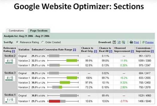
The answer to these questions is: No one knows. Without testing no one would ever know. It’s like two jockies bragging about how fast their horses are. They’ll never know which one’s faster unless they race them. There are two ways to test a user interface to maximize conversions. The first is simple AB or ABC testing. The second is called multivariate testing. Google Website Optimizer is a free tool that offers both options. Below is a screen shot of Google’s powerful optimizer tool.
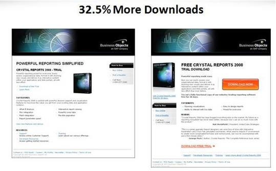
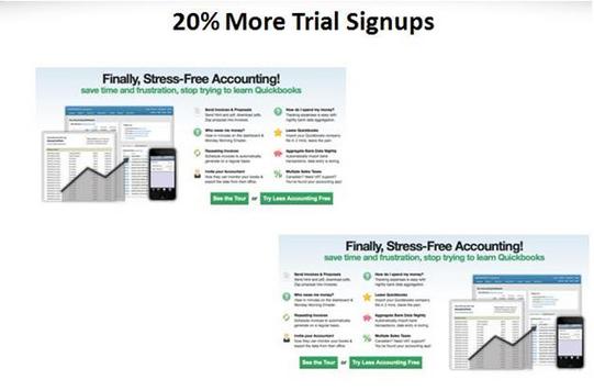
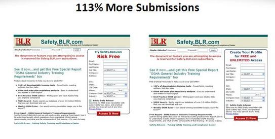
Below are just a few examples of what testing can do for a website’s user interface, usability, click-through rate, lead capture and sales:
*Images provided by James Paden
