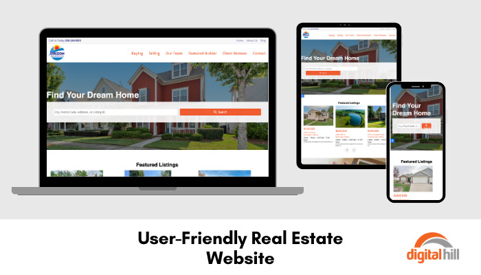
User-Friendly Real Estate Website

Having a user-friendly, fast-loading website is important for any modern business. Orizon Real Estate Inc. needed a new website that potential buyers and sellers could easily navigate. Below are some of the key features that make this Real estate website effective.
Home Page Features
Search Bar
The first thing website visitors see on the new Orizon Real Estate website is the search bar. This feature allows visitors to search for an area, address, or listing ID. For a real estate website, this is crucial, as buyers do not want to search through hundreds of irrelevant listings to find a few in their desired area. The search call-to-action is in Orizon orange to stand out and ensure branding cohesion.
Slider
On the homepage is a dynamic slider tool, which allows the Orizon Real Estate team to showcase their featured properties. Every ten seconds, the images and brief descriptions change. Once the loop finishes, it repeats. There are als navigation buttons below the images to allow website visitors to go back or forward through the listings. Each image is accompanied by the house price, address, number of bedrooms and baths, property and house size along with the real estate agent on the listing.
This ensures that visitors see the most important details without overwhelming them. On a mobile device, the listings show one at a time and change every four seconds.
Testimonials
At the bottom of the homepage is a slider featuring client testimonials. The slider changes every five seconds allowing users to quickly see multiple short testimonials. Below the slider is a call-to-action leading the website visitor to more testimonials.
Navigation
The new Ozion Real Estate Inc. website features a main menu bar, and a small top navigation bar to help visitors quickly and easily navigate the website.
Main Menu
The main menu bar is above the feature image on every page and features the necessary links. There are menu options for:
- Buying – This takes web visitors to a webpage with additional details about buying a home and offers a contact form. When filled in, this contact form is sent to the Orizon team and labeled as a buyer request.
- Selling – This takes website visitors to a webpage with details about selling their home and features a link to their brochure and a custom contact form. When filled in, this contact form is sent to the Orizon team and labeled as a seller request.
- Our Team – This webpage features all staff members, roles, and photos.
- Featured Builder – This page will feature builders that Orizon works with for new builds and development projects.
- Client Reviews – Visitors can easily view all testimonials with ease.
- Contact – Sends visitors to a general contact form, phone number, and address details.
Top Navigation Bar
The top navigation menu features three links to the Home, About Us, and Blog pages. These three pages are informative for all visitors, whether they are buying or selling.
Having a simple, aesthetic, and user-friendly website allows Orizon Real Estate to offer amazing service to potential clients at all times, including outside of office hours. To discuss your website needs, contact Digital Hill today.
